
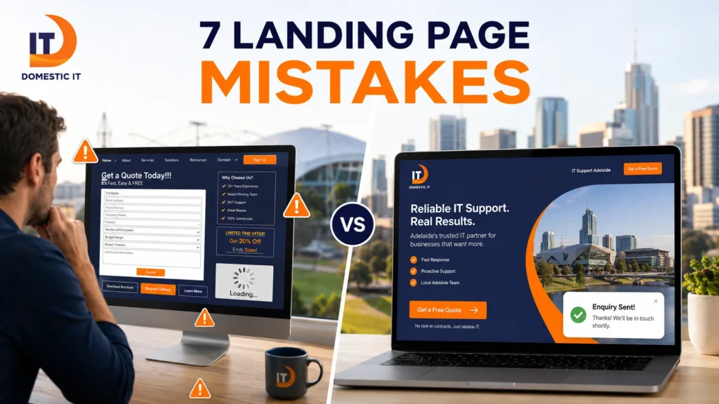
Landing Page Mistakes can quietly waste advertising budget even when your Google Ads, social campaigns or email promotions are bringing the right people to your website. A visitor may click because the advertisement looks relevant, then leave because the page feels confusing, asks for too much information or does not clearly explain what happens next. The problem is often not the amount of traffic you are buying. It is the experience people have after the click.
For Adelaide businesses investing in paid traffic, fixing these problems can make an existing campaign more useful before increasing the advertising budget. The goal of a landing page is simple: match the visitor’s intent, reduce unnecessary friction and guide them towards one meaningful action.
Here are seven common mistakes worth checking.
1. Using One Generic Landing Page for Every Campaign
One of the biggest mistakes is sending several different campaigns to the same page.
Imagine your business advertises three separate services. One advertisement promotes website redesign, another promotes ecommerce development and another targets small-business websites. If all three visitors arrive on a general homepage, each person has to find the relevant information themselves.
That creates unnecessary work for someone who has already told you what they want by clicking the advertisement.
Dedicated landing pages allow you to adapt the headline, examples, benefits, proof and call to action to the campaign.
You do not need dozens of pages simply for the sake of having them. Create additional landing pages when the audience, offer, service or intent changes significantly.
For example:
- Google Ads for website redesign → redesign landing page
- Facebook campaign for a free website consultation → consultation landing page
- Ecommerce campaign → ecommerce-focused landing page
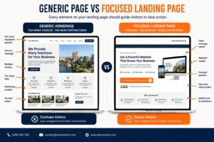
This approach also makes campaign measurement cleaner because you can see which offer and audience generate the strongest enquiries.
For a broader explanation of how campaign pages should be structured, see Domestic IT’s guide to landing page design in Adelaide.
2. Giving Visitors Too Many Goals and Distractions
A landing page should make the next action obvious.
Problems begin when the visitor sees a large navigation menu, several service links, social-media buttons, newsletter signup, multiple offers and competing calls to action.
They clicked because of one promise. The page should help them complete the action connected to that promise.
A campaign for a website consultation, for example, might use:
Primary action: Request a Website Consultation
You could repeat that CTA near the hero section, after your benefits and near the bottom of the page. The wording can remain consistent because all three buttons lead towards the same goal.
This does not mean stripping away every useful link. Privacy policies, contact information and relevant supporting evidence can remain accessible.
The distinction is between helpful supporting information and competing conversion paths.
A visitor who needs reassurance may want to view your website design portfolio, but the portfolio should support the decision rather than become the main objective of the campaign.
Australian landing-page agencies also commonly emphasise campaign-specific, focused experiences rather than sending paid visitors through a general website journey.
3. Matching the Wrong CTA to the Buyer’s Journey
Not every visitor is ready for the same commitment.
Someone searching for “best website platform for a small business” is probably in a different stage of the decision process from someone searching for “hire Adelaide web designer.”
The first visitor may want information.
The second may be ready to request a quote.
If you ask an early-stage visitor to book a sales consultation immediately, the request may feel premature. On the other hand, giving a ready-to-buy visitor only a generic downloadable guide creates an unnecessary extra step.
Match the CTA to intent.
Examples include:
| Visitor intent | More suitable CTA |
|---|---|
| Learning | Download guide or compare options |
| Comparing providers | View case studies |
| Evaluating a service | Request consultation |
| Ready to buy | Get a quote or book |
| Returning customer | Contact support or start project |
Your advertisement and landing page also need to make the outcome of clicking clear.
Instead of:
Submit
Try:
Request My Website Consultation
Instead of:
Click Here
Try:
Get My Project Quote
The visitor should know whether clicking a button opens a form, schedules a consultation, downloads something or completes a purchase.
Google specifically recommends making landing pages relevant to the advertisement and ensuring that users can easily find what the ad promised. You can review the official Google Ads landing-page guidance.
4. Talking About Features Instead of Customer Benefits
Businesses naturally want to explain what they provide.
The problem is that visitors are usually more interested in what the service will help them achieve.
Consider these two examples:
Feature-focused:
“We create responsive WordPress websites with custom layouts.”
Benefit-focused:
“Give customers a fast, professional website that is easy to use on mobile and simple for your team to update.”
Both describe a similar service, but the second connects the feature with a practical outcome.
Landing-page copy should answer questions such as:
- What problem does this solve?
- What becomes easier for the customer?
- Why should they choose this approach?
- What risk does it reduce?
- What result are they trying to achieve?
This is especially important for technical services. Customers may not care which framework, plugin or development method you use unless it affects performance, security or their ability to manage the website.
Domestic IT’s custom website development service can be internally linked where visitors need more information about advanced functionality, but the landing page itself should stay focused on the customer’s desired outcome.
Do Not Ignore Buyer Concerns
Benefit-focused copy should also answer the concerns stopping someone from making contact.
Depending on the service, these may include:
- How long will the project take?
- Can my existing website be used?
- What happens after I enquire?
- Will I own the website?
- Can I update it myself?
- Do you provide ongoing support?
- Will the website work on mobile?
Relevant FAQs, testimonials, portfolio examples and process explanations can address these questions without turning the page into a long sales presentation.
5. Making Forms Harder Than They Need to Be
Every additional step creates an opportunity for someone to abandon the enquiry.
A landing page may have excellent copy and design but still underperform because the form asks for too much information.
For an initial web-design enquiry, you probably do not need a customer’s full postal address, ten project questions and account registration before they can contact you.
Start with the information required to have a useful conversation.
For example:
- Name
- Phone number
- Required service
- Short project description
More detailed information can be collected later if necessary.
Avoid Forced Account Creation
If a visitor only wants to request information, forcing them to create a username and password adds a step that provides little immediate value.
Account creation makes more sense when the user genuinely requires an ongoing account, such as for:
- Customer portals
- Membership systems
- Software products
- Ecommerce accounts
- Subscription services
For a simple quote request, keep the process lighter.
Optimise the Form Experience
The form should also work properly on mobile.
Use:
- Clear field labels
- Large tap areas
- Appropriate field types
- Visible error messages
- Minimal required fields
- Clear confirmation after submission
The confirmation matters.
After clicking, customers should know their enquiry was received and what happens next.
For example:
Thanks for contacting Domestic IT. We’ve received your enquiry and will get back to you shortly.
If your campaign requires complex quoting, CRM connections or lead routing, link visitors who need more technical details to your business website design services.
6. Allowing Slow Loading Times to Waste Paid Traffic
Advertising platforms charge for traffic, not for patience.
If someone clicks an advertisement and the landing page takes too long to become usable, part of your advertising budget is effectively being spent on people who may never properly see the offer.
Common causes of slow landing pages include:
- Oversized hero images
- Background videos
- Unnecessary animations
- Multiple tracking scripts
- Poor hosting
- Too many plugins
- Third-party widgets
- Unoptimised fonts
- Large image galleries
The solution is not to remove every visual element. Prioritise the elements that support the decision.
Compress images, remove unnecessary scripts and avoid loading features that provide little conversion value.
Google’s PageSpeed Insights can analyse a page using performance data and highlight areas that may need improvement. Use Google PageSpeed Insights when reviewing your campaign pages.
Your landing page should also be monitored after launch. New scripts, marketing tools and content changes can gradually affect performance.
For broader technical issues, Domestic IT’s existing guide to small-business website features explains why speed, responsive design and security should form part of the website foundation.
7. Treating Mobile as a Smaller Desktop Page
A landing page may look excellent on a large monitor and still perform poorly for mobile visitors.
Simply making a desktop layout fit a smaller screen is not enough.
Mobile visitors may be using one hand, moving between locations or relying on a slower connection. Important information and actions need to remain easy to access.
Check:
- Is the headline readable immediately?
- Is the primary CTA visible?
- Are buttons easy to tap?
- Is the form comfortable to complete?
- Does the page load unnecessary desktop imagery?
- Is the phone number clickable?
- Are testimonials readable?
- Does any pop-up cover the screen?
Also consider the order of content.
On desktop, an image and form may appear side by side. On mobile, those elements will stack. Make sure the mobile order still makes sense.
If the image appears first and pushes the headline or enquiry form far down the screen, reorganise the layout.
Mobile design should be tested as part of the campaign itself rather than after the desktop page has been approved.
Business owners deciding between template tools and custom development can also read DIY vs Professional Web Design to understand how different build approaches affect control, performance and flexibility.
How to Avoid These Landing Page Mistakes
Avoiding these problems does not require redesigning the page every week. Use a repeatable review process.
Check the Campaign-to-Page Match
Open the advertisement first.
Then open the landing page and ask:
Does the headline continue the same promise?
Does the page show the same service or offer?
Would a first-time visitor immediately understand why they arrived here?
If the answer is no, improve message alignment before changing colours or button styles.
Complete the Conversion Yourself
Do not only look at the form.
Use it.
Complete the entire process on desktop and mobile. Check whether the form is easy to understand, whether error messages work and whether the confirmation appears correctly.
Confirm that the enquiry reaches the correct inbox or CRM.
Remove One Unnecessary Decision
Look at every link and button.
Ask whether it helps the visitor complete the campaign goal.
If not, consider removing or reducing its visual importance.
Review the Page From a Customer’s Perspective
Businesses often build pages around what they want to say. Customers think differently.
Review whether the page answers:
- Is this service for me?
- Can I trust this company?
- What benefit do I receive?
- What happens next?
- How difficult is it to get started?
Track Real Conversions
Page views are not enough.
Depending on your campaign, track:
- Form completions
- Calls
- Bookings
- Purchases
- Quote requests
Then compare results by campaign, device and landing page.
Do not judge a page only because you personally like its appearance. Use actual customer behaviour to decide what needs improvement.
Frequently Asked Questions
What is the most common landing page mistake?
One of the most damaging mistakes is failing to match the page with the campaign that brought the visitor there. The headline, offer and CTA should clearly continue the message used in the advertisement.
Should every advertising campaign have its own landing page?
Not necessarily. Separate pages are useful when campaigns target different services, audiences, offers or stages of the buying journey. Closely related campaigns may be able to share one focused page.
How many CTAs should a landing page have?
A landing page should usually have one primary conversion goal. You can repeat the same CTA several times throughout the page, particularly on longer pages.
How many fields should a landing-page form have?
There is no perfect number. Ask for the minimum information required to begin the next step. Higher-value or complex services may need more qualifying information than simple enquiries.
Should I remove navigation from my landing page?
For focused paid campaigns, reducing the main navigation can help limit unnecessary distractions. Keep essential links such as privacy information and relevant contact details accessible.
Why are mobile landing pages important?
Campaign traffic frequently comes from smartphones, so visitors need to be able to read the offer, complete forms and tap calls to action comfortably on smaller screens. Poor mobile layouts can interrupt that journey.
How do I know which landing page mistake is reducing conversions?
Start with analytics and conversion tracking, then manually test the complete customer journey. Compare desktop and mobile behaviour, form completions, campaign relevance and page speed before making major changes.
Final Thoughts
A landing page does not need more sections, more animations or more complicated technology to perform better. In many cases, improving results means removing friction.
Make the campaign message specific. Give the visitor one clear direction. Explain the benefit. Address genuine concerns. Keep the form reasonable. Make the page fast and ensure the mobile experience works properly.
Most importantly, measure what happens after visitors arrive.
Domestic IT provides professional landing page, website design and development services for Adelaide businesses that want to turn digital traffic into genuine enquiries.
For examples of our work, visit the Domestic IT portfolio, or contact us to discuss your next landing page campaign.